Thursday 2 April 2015

Defining My Target Market- Pro Studies


Defining Target Markets


In my professional studies lesson, we covered how to define your target market and also how to understand and cater to their needs.
In illustration, well in any profession really, in order to sell your product you need to understand what your intended consumer wants and needs, this is known as my target market.  
Every piece that I produce will have an intended consumer, the someone I want to purchase my work, and this may change from piece to piece. So it is always important for me to first define who I am aiming it at. 


1- To start defining my target market I would first look at what and who my work would be                                                               more appealing towards:
                                                              females or males
                                                                 age groups
                                                                regional areas
                                                          education or interests
                                                                occupations
                                                            average incomes

These are just a few groups that I could look at and within these there are also smaller branches which would lead to a more select target market.
 Each target market has their own needs and wants and to find out which I want my work to appeal to I will then have to research which groups are more drawn to certain things and what they want. 
For example: stereotypically a male would prefer a piece of work in more masculine colours whereas a female would be more drawn to feminine colours and rounded shapes.

2- Before choosing my target market I would then also ask my self:

- would these people be attracted to my art?
- do these people make the decisions about buying art?
 ( If I aimed towards children I would also have to create a piece which deems appropriate by the childs parents) 

- can these people afford my art
 ( there's no need aiming my work to someone if they cant afford it because it will never get sold )

- do these people have a need of some sort for my art?
(why, and what if these people decide to buy my art what would they do with it?)

- do I like these people?
(If I don’t enjoy being around them, I will dislike creating the work because Id have to spend a lot of time with them, thinking about  them and researching them)

3- After this I would then chose between 2-3 different markets which seem like good contenders. I will then go out (online or offline) and find people in that market and ask them questions. I wouldnt ask them questions about your business. Id ask them questions about themselves. In order to find out about there likes and dislikes.

4- After I have collected my data I will then decide on ONE target market and this will be the market which gave the data most fitting towards my project.  If I chose more than one target market this would mean more research and more work overall.


Sunday 18 January 2015

illustrator research- visual culture


Chrissy Lau


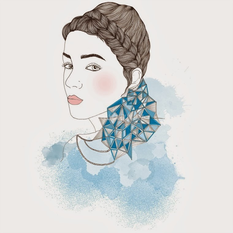
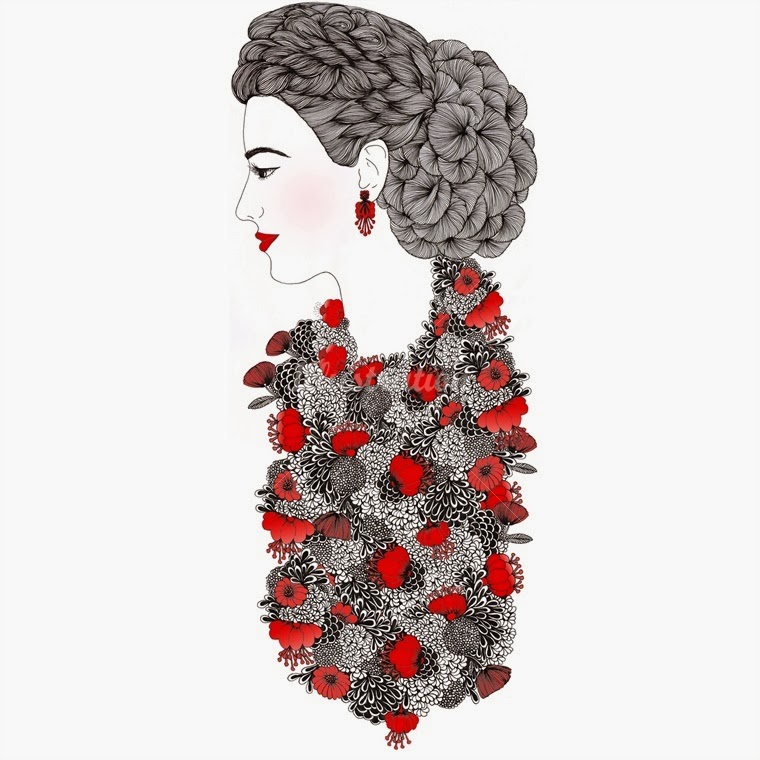
Chrissy Lau is a Sydney based illustrator with over 11 years commercial experience. 

Her illustrations are predominantly hand drawn in ink & digitally coloured in Photoshop. 

Chrissy's style is distinct, with a strong attention to detail focusing on intricate patterns & lines.

She takes inspiration from her Chinese heritage & nature.

Fashion, portraits & children's illustrations are her expertise.

She has designed a collection of coins for the Royal Australian Mint & apparel designs for Mambo.

Samsung recently commissioned her to illustrate on their Galaxy Note II for their Australian wide billboard & YouTube campaign.

Taking influence from her Chinese heritage she designed dragon flags for the City of Sydney to celebrate Chinese New Year.

hrissy's creative career includes curating exhibitions as an art gallery manager, running her own clothing label, exhibiting in the UK & Australia.

She also has 5 years experience in online digital media and currently focuses her expertise in Search Marketing.


She creates these stunning images and they are really appealing to me.
 I love her fluent smooth lines and attention to detail.
 The subtle sparing colour makes all her images "pop".
In my work in the future I will pay much more attention to my use of line, and also how I use colour because Chrissy Lau proves that you dont need to add an awful lot of colour in order to make an image appealing or different. 
She, as an illustrator, has made me think alot more on how much I think about my colour choices and how much I use.

Lady bird books- visual culture


Lady bird books.


I love Lady bird books, their pocket-sized physic and beautiful illustrations have always been well loved by children all over the world. 
The series of books have managed to cover nearly every subject and interest.
 They even helped kids learn through the use of keywords.  
Some of the best known illustrators have illustrated a variety of Lady bird books.
The first lady bird book was produced by a printer called Wills and Hepworth during the first world war.
The first "familiar" pocket sized Ladybird book came about in 1940, during the Second World War. 
An animal series including Bunnikins and Downy Duckling was an instant hit with children, who enjoyed both the full colour illustrations and the stories. 


(DOWNY DUCKLING- 1940)

After the War, Ladybird took a great step forward. They knew that school books, though dull, always sold well, and they expanded into educational non fiction. Well known authors and artists were commissioned to write and illustrate books on nature, geography, history and religion.


(LADY BIRDS- THINGS TO MAKE)


Lady bird books of the present day


Today, Ladybird is part of Penguin Children’s Books alongside alongside Puffin, Frederick Warne, Sunbird and BBC Children's Books, and continues to evolve with the needs of today’s parents and children.Ladybird is also an innovator in digital publishing, helping to guide children through important learning milestones and support them during every stage of their development via new digital platforms. For instance, the Baby Touch: Peekaboo and Baby Touch: Happy Babiesapps - an extension of the best-selling books


(VAROUS MODERN BOOKS AND APPS BY LADY BIRD BOOKS)


The ladybird books were a large part of my childhood and helped mould my thoughts on what an illustration is. The company itself have grown with the times and managed to keep ontop of whats popular and what the consumer wants. You can find ladybird books in nearly every book store. They are always so bright and colourful and eye catching and they are never ridiculously priced, which makes them more appealing. 
Whilst researching I have realised if this company didnt keep on top of current styles and trends and stayed the same as they were originally the company wouldnt be so popular today. In the future I will pay  more attention to what is trending and what people want and  try and produce my work around this rather than just creating work which pleases my self. By doing this it will make my illustrations more appealing to a larger group of people.   


(A COLLECTION OF ORIGINAL LADYBIRD BOOKS)


self identity and creative voice- visual culture


Self Identity


For my task this week I was asked to try and identify my self as an illustrator.
 Prior studying at university I never classed myself as an illustrator so I don’t really have any official works which I think could portray what and who I am. 
I still don’t think I fit into any one category of illustrator there is many forms which I could land  
Children's Book, 
Advertising, 
Editorial,
 Graphical, 
Product, 
Fashion, 
Gallery 
Prints etc.
 So at the moment I would class my self as a freelance illustrator. As I am still finding myself.


( The above image was for a book I was illustrating. It is ink on paper, after this I then went on to colour it with watercolours, which I ended up prefering the shaded version so used this one)


( The above piece was something I created outside of uni hours, It is watercolours and ink, and its purpose was just to catch up on my inking skills and tbh I quite liked the outcome, its made me get back into my water colours and ink)


(The above image was an initial sketch for "How the whale got its throat" a just so story, Unfortunately after this I changed my book choice and abandoned these illustrations, after finishing this module, I will be returning to these pieces and finishing them in my personal time)


( This piece was created for my friend Alice at the beginning of uni, It was the first time I used photoshop, and a wacom. All things taken into hand I dont think its too bad but If I were to recreate the image, knowing what I do now I feel the piece would have alot more depth and better line work)


( This piece was a set of 3 images based on see no evil hear no evil and do no evil, this was the best image out of the three. I created this when I was experimenting in photoshop.)

These are a few examples of my work from university. I think they are the best representations of my style and who I am as an illustrator. I am still defining who I am within the world of illustration and I think I always will. But throughout my time at university I am slowly finding what I work best with and what suits my style.  But I will always try new things in order to get a step closer to defining me as an illustrator.

Symbolism and colour in illustration- visual culture


Symbolism and colour in illustration


Colours hold significance for people around the world. 
Not only do colours influence emotion, but they also hold meaning in religion and various cultures.
Colour symbolism in art and anthropology refers to the use of colour as a symbol in various cultures
There is great diversity in the use of colours and their associations between cultures and even within the same culture in different time periods.
 In fact, the same colour may have very different associations within the same culture at any time. For example, red is often used for stop signs or danger. 
At the same time, red is also frequently used in association with affairs of the heart. 
White variously signifies purity, innocence, wisdom or death. Blue has similarly diverse meanings.
Symbolic representations of religious concepts or articles may include a specific colour with which the concept or object is associated. There is evidence to suggest that colours have been used for this purpose as early as 90,000 BC

Color Symbolism Chart


Symbolist artists used mostly mythological and dream like imagery in their works.
Symbolism in art influenced Art Nouveau style and Les Nabis.
The Nabis were a Symbolist, cult-like group that were creators of a subjective art that was deeply rooted in the soul of the artist.


The Purple Book and The Yellow Book

In the world of illustration Symbolism is portrayed amazingly in The Purple Book: Sensuality and Symbolism in Contemporary Art and Illustration.
 This book is filled with illustrations and creations which explore the idea of fantasy, sensuality and the erotic imagination. 
It represents the human desire's and relationship with dream states, fiction and symbolism.
 The majority of the work in this book is unpublished, personal work and the entry in the book is usually the first print of the work.


This book is inspired by The Yellow Book which was published in the 1890's, the colour yellow in this time was seen as sexualised and the colour purple today is seen sensually.


 "The color of The Yellow Book was an appropriate reflection of the 'Yellow Nineties," a decade in which Victorianism was giving way among the fashionable to Regency attitudes and French influences; For yellow was not only the decor of the notorious and dandified pre-Victorian Regency, but also of the allegedly wicked and decadent French novel" (Weintraub, 99).


 Its pages contained a  vareity of writers and artists, particularly women and relative newcomers such as Arnold Bennett, Charlotte Mew, Maurice Baring, who would make their reputations in the coming decades.

The use of colour vastly changes how an image is viewed by the consumer, it can evoke certain feelings and emotions. In the future I plan to pay more attention to the colour I use in my work as it is what really sells an image and can really catch the eye of the consumer.

Fredrun Shapur and illustration as a product - visual culture


Fredrun Shapur


Shapurs Background

Shapur, was born in 1929 in South Africa. His career demonstrates the true internationalism of modernism at mid-century, as he based himself in London, collaborated in Princeton, and was manufactured in Switzerland.
 Shapur first enrolled at St. Martin’s in London, and then studied graphic design at the Royal College of Art. 
There, he was taught by Edward Bawden and Abram Games; Games’s work included the logo for the Festival of Britain in1951. 
Shapur worked in Prague in 1957, where he admired the growing array of Czech modernist toys.


Shapur opened his own office in 1959, working on logos, packaging and posters. 
He was inspired to create toys by his own children. 
In 1963, he designed Animal Puzzle, based on a set of interlocking squares, and Four-Way Blocks, using square rods and silk-screened graphics to allow children to make their own staccato creatures. 
His children’s book, Round and Round and Square,1965, employed a similar reduced geometric vocabulary. 


(SHAPURS CHILDRENS BOOK, ROUND AND ROUND AND SQUARE, 1965)


Shapur’s first toys were handmade, sanded by himself and his wife.
He hired artisans to increase production.


He designed logo for Miller’s new company, Novo Toys and continued to design toys for variety of European companies until 1980. 
After his retirement, he began working with discarded objects, leather and paper.
 The book includes examples mask-like faces made from sardine tins. 

Image of Fredun Shapur, Multi-view puzzles - set of 4 titles

(FREDUN SHAPUR, MULTIVIEW PUZZLES- SET OF 4 TILES)


To broaden illustrations you can apply them to products of various natures.
By doing this it makes your illustrations more usable and accessible for your customer.
You can apply your illustrations to almost anything. 
Or you can create something in order to fit your illustration just as Shapur did with his illustrated toys. 
In the future I will try and use this in my own practise, by creating post cards and maybe even by creating items which go along with the illustrations.  


Albums and art work, youth culture of the 50-60's


Albums and art work, youth culture of the 50-60's


The music of the 1960s dawned an electric, psychedelic version of rock, thanks largely to Bob Dylan and his use of the electric guitar.
The newly popularized electric sound of rock was then built upon and changed into psychedelic by artists like 
Pink Floyd and the Beatles
The '50s and '60s were a great time for album cover design. 
The great Blue Notes and Prestige LPs, for one. 

Pop Art

Pop art is an art movement which developed in the 1950's and progressed for decades after and is still a popular art movement today.
 The traditional pop art style consists of the use of very bright colours and bold black outlines, relating to that of a comic book style.
 It was usually used as part of advertising in the 50's. 
The two most well known and popular pop artists are Roy Lichtenstein and Andy Warhol.


( ROY LICHTENSTEIN, left , ANDY WARHOL, right ) 


 When pop art is mentioned these are the two artists you immediately think of because of their iconic art works such as Andy Warhol's Campbells Soup can and Marilyn Monroe and Roy Lichtenstein's Crying Girl. 


 (CAMPBELLS SOUP CAN, left, CRYING GIRL, right)


The pop art movement has been a huge influence on visual arts and still is to this day. Alot of albums of this time used bright colours and pop art esque styles this was common of the time as it was popular.


(CREAM, DISRAELI GEARS)

(LOVE, FOREVER CHANGES)

One of the ways Pop Art differed themselves from traditional art was by combining the mass-produced imagery of advertising with fine art.

Minimalists

Minimalists sought to create pure, geometric, abstract art in which the physical properties of space, scale, and materials were explored as ends in themselves rather than as metaphors for human experience.
Many Minimalist artists used industrial materials such as aluminum, plywood, sheet metal and Plexiglas. 
This challenged the notion of what constituted “fine art” and shared the Pop artists’ interest in using non-art materials.


( A sculpture by  Donald Judd)


I could apply various points from the art in the  50s and 60s to my own work. I could do this by studying more on minimalism  and applying it to my own work as I tend to over think my own work and try adding to much into it. I think if I take a step back and constructively criticise my own work I will be able to adapt and expand on my own work.

Tuesday 13 January 2015

Conclusion and Evaluation


Conclusion and Evaluation.


My initial idea for this project was to try and portray someone's inner animal through the use of body paint. I chose to use body painting because the idea of using a human body as a canvas and how it would change the emotional response of the person viewing it, once they realised it was painted on skin and not on a traditional canvas,was defiantly something I would like to explore.Multiple media designs often result in interesting and intriguing outcomes so I want to bring together more than one material. I feel that with such an open brief it would be a perfect opportunity to experiment with body illustration as this as an art form is often overlooked.  
 When I started researching about body painting I noticed that as an art form and as a technique, its extremely marginal, and it hasn't really been used in the field of illustration, I did a lot of experimenting with designs and I quickly noticed that it was a lot harder than I had expected.
Working with body paints and make up is a totally different experience than working with normal paints and pencils. Working on skin was also a weird experience.
During my development stages I found it difficult to try and create a piece that would look convincing and attractive. As I am used to working in 2D and on paper this was an extremely difficult task. I over came this problem quite simply by practising. 

Looking back on my development stages I can see how much I have progressed with this technique. The zebra design was the first image I created and the simplicity of it isn't exactly high quality. 
The wolf design I then created had more promise I included more detail and took more care on the design and structure of the image although I don't think it is fitting for a final image as there still isn't enough detail.
I then tried something new and painted my hands. This was refreshing and I enjoyed it, the only problems I had with doing this was that Im left handed and found it difficult to use my right hand to paint my left. Also it was bad that i only have small hands so the space in which I had to paint was small so unfortunately I couldn't create something with high detail.
I then decided to create a lion look, this one was extremely successful and I will be using this as my final piece, the only problems I encounters when creating this piece was trying to make sure both sides were equal and that the eyes didn't look wrong.
If i were to recreate any of these pieces I would highly consider using a model to paint on as I think it would make the whole thing much easier and I would be able to create images with much more detail. 
This is something that I will continue to do in the future but as a hobby not as part of my illustration. Unless I had the opportunity to work on a full bodied model as I think that would be an incredible chance.  
Over all I think the project went well although I would of loved to be able to create more images, I think I spent too much time researching at the beginning of the project when I should have concentrated on  creating the actual images to a higher quality.

Tiger Paint


Tiger Paint


I decided to try something a little different than just the basic face paint and decided to try some hand painting, as I came a cross a couple of artists during my research which do this. I decided to try and create a tiger image. 
Painting on my right hand was easy and not much of a challenge but painting on my left hand (as I am left handed) was a struggle.
Deciding where the image should start on one hand and end on the other was also a challenging task as if any natural skin tone was showing it would ruin the effect. 
Also deciding the camera angle was difficult as I has to try and arrange the camera in a way that would make it look like the tiger print on my hands lined up with my facial features. If I was to do this again I think I would work on a model instead of trying to create the image upon myself.  
I think it would be a great effect if I used more than one pair of hands and hand painted multiple hands in order to create a bigger image.


Lion Design


Lion Design


This painted animal is my favourite. I like the detail and depth I managed to create with fine brush strokes and shading. 

To create this image I built up layers of fine brush strokes in order to create a fur like feeling, I used orange,brown a touch of black and yellow. 
I then positioned the eyes over my own eyebrows. This was more difficult then originally expected as making it look realistic was hard. On previous attempts the eyes weren't the same size or were totally uneven. I added shading and contouring with darker shades of the colours. I then added the nose with a black paint. 
If I were to recreate the image I would make the nose smaller and try and make thee eyes more realistic.
This is deffinatly my favourite out of the three and I will be using this as my final piece.

Wolf Attempt


Wolf Idea


For my second make up I decided to attempt a wolf look, I still don't particularly like this piece and I think the muzzle of the wolf stands out enough. 
From the previous idea of the zebra I decided to try and add in smaller finer strokes with a detailed artists brush in order to try and add more of a realistic fur texture.
To create this look I painted around my eyes and mouth white and the rest of my face a light grey. I then flicked on a darker grey paint to create a different texture. I then added darker grey,white and black lines flicking outwards from my face in order to create a hairy fur texture.
After this I painted my nose dark grey and sponged on black and white to create a wet look.

I then placed down the positioning of my teeth with a white and filled them in. 
I drew around my newly placed teeth with a pink eye shadow to create gums,and shaded the upper parts of the teeth to make shadows. 
After this I filled in the inner section and in between the teeth with black to add depth and to hide my lips.
I added in brown shading for the muzzle  and to add shadows and depth. Finally I added whiskers and I was done.

If I was to re create this look I would try and make the muzzle of the wolf stand out more and depthen the eyes with more shading and dark areas. I would  also add more detail and more teeth and more detail in the fur.

Zebra Attempt


Zebra attempt


I decided to try and portray a zebra through body illustration, unfortunately I don't think it turned out that good, there isn't enough detail in the make up. 
I firstly painted my face plain white and then simply added theblock stripes with a fine artists brush.

I dont think this piece was a success. This will not be my final piece.
I think in order to create a more detailed look I sould have added more texture to the black lines to give the look of hair more, also I would extend the make up down onto the neck and chest in order to give the piece more depth.

Monday 12 January 2015

Artist Research - Alexa Meade


Alexa Meade


Alexa Meade is a LA based artist best known for her body painting skills.She has had exhibits at the Saatchi Gallery in London, the Smithsonian's National Portrait Gallery in DC, Postmasters Gallery in New York City, Galerie Ivo Kamm in Switzerland, and Ingo Seufert Gallery for Contemporary Photography in Germany. 
Her art has been in exhibitions also featuring the work of 
-Andy Warhol 
-Shepard Fairey
-Banksy
 Her work has received critical acclaim from 
-CNN
-WIRED
-The Wall Street Journal
-Washington Post
-NPR
-The Guardian.

Images of her art are being used to illustrate forthcoming manuscripts by philosophers Slavoj Žižek and Alain Badiou. Her work is being written into art history textbooks around the world. She has given lectures at the California Institute of the Arts, UC-Berkeley, National Geographic London, WIRED, and the TED Global Conference. Her TED talk “Your Body is my Canvas,” has been viewed nearly 2 million times.
Mercedes-Benz, Denim & Supply Ralph Lauren, and MINI Cooper have commissioned Alexa to create art installations around the world. Her portrait subjects include such individuals of note as triple-Grammy Award winner Gotye.
Jay-Z’s Life & Times made a video about Alexa’s creative process that also captured a sneak peek at one of her side projects: transforming her Los Angeles home into a Funhouse. Other side projects include turning her garage into a camera obscura theater, designing tessellating shape tiles, and making a puzzle for the blind.